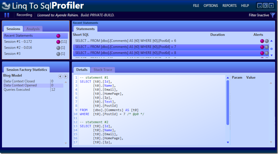
Linq to SQL Profiler – Progress
We have mostly done all the infrastructure work that actually needed to be done, what is left is polishing and “i18n” (for lack of a better word).
One of the things that I want to do with L2SPRof is to create a different identity from NHProf and HProf.
This is me just playing around, not something that is final, but I would still like your thoughts:
Two closing notes:
- It took me about 30 minutes of playing with Blend to get this to work. As usual, Christopher and Rob are flat out amazing, not just for creating good UI (and great UI architecture), but doing it in such a way that a self processed UI n00b can create reasonable results from it.
- I know that there are some people that don’t like the divergence from the standard Windows scheme. I am already familiar with the arguments, and I have good reasons to go that route.


Comments
I like it, but I'm partial to blue's and green's. The menu location is interesting but wouldn't bother me at all.
Oren, when it comes to software development and best practices, to me, you are right there at the top.
But I think you are color blind or something. srsly.
I like blue color but this theme is a bit too dark.
Not enough contrast between a selected item and its text.
Too dark IMO. I don't think tinting the text is a very good idea either.
You could always have a set of built in themes and let the user decide or customise it how they wish?
It looks very good, but I think it just needs just a bit more contrast. The lighter colors (the content areas) may need to be a bit lighter. Granted, I'm using a CRT. In general, I really like the theme.
The background colors should be lighter and not blue.
Are you going to have a different scheme for every ORM? As a user, that would irritate me
Diverging from the standard OS UI scheme is only a problem if the results look bad. I think NHProf is pretty safe here so far.
I think warmer colors would be nice (this is what I like about NHProf theme).
This one is oppressing IMO.
Maybe this scheme conveys a subliminal message telling you to switch to NHibernate, which is warm and fuzzy...
Congrats for having built an architecture where you just plug in ORMs as if they are BCL classes or something...agree with the comments on the color scheme, though - it may be pretty, but the low contrast selection will break on many projectors in a presentation. There will be nothing to see...
Hey Oren,
I'm so excited about LINQ to SQL Profiler, but the color is too "Azure" :)
The color scheme is awesome. However, I would say darker schemes associate with a more serious and complex stuff, so having Linq-to-Sql darker than NHibernate does not feel correct.
I would actually use a much lighter scheme, matching lightweight and limited nature of Linq-to-Sql.
I really liked the NHprof colors, but this one... not so much. Blue is my favorite color, but I think the shades of blue don't fit together (slightly different hues). You have purple-blue, greenish-blue, and even a gradient that goes from purple to blue.
I hope it gets finetuned somewhat :)
Less purple, more light blues.
Deviating from the standard colour scheme is bad for those who find it difficult to read the screen and have to use e.g. one of the high contrast colour schemes in order to make things legible.
Oren doesn't seem to consider this an issue worth worrying about. I would suggest that it should be, my reasons being:
It seems rather unkind to exclude fellow developers from using the software just because you can't be bothered to develop it according to accepted standards.
Some US organisations may refuse to allow *Prof to be installed as there it is possible for employees to sue their employer for providing software which is not accessible and which they are required to use in order to perform their duties.
Why not make it skinable so everyone is happy? Thought that was suppossed to be simple with WPF.
Agree with you John Farrell!
Agree with Rik Hemsley and want to add...
In addition to the visual issues caused by moving away from the Windows standard:
keyboard support sucks
copy/paste sucks
integration with screen readers sucks
title bar keeps drawing over your UI due to third-party apps (Ultramon as one example)
Too vibrant.. Strains my eyes.. :)
Honestly? I don't know why everybody's trying to pioneer into new graphical waters, why not keep it simple and plain? Dark colors tend to convey and underground and unprofessional feeling, this combined with the playful logo and the gradients makes the application look way less professional than it probably is.
I missed the menu completely...
What menu?
Would it take a lot of effort to let the colors be customizable? That seems like the easiest approach and then you don't have to worry about it as much.
Comment preview