Don’t throw the information at me, I expect you to work at it
Here are two examples of two apps doing the same thing, using drastically different UI paradigm.
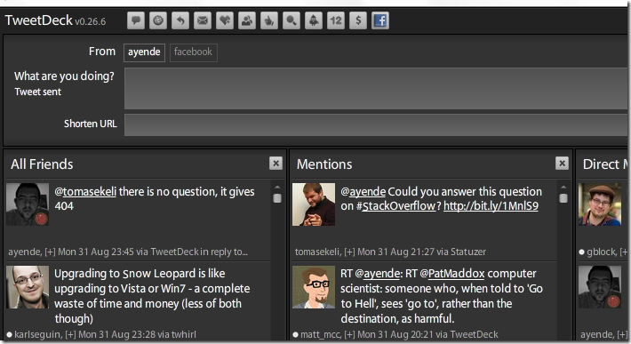
As you can see, TwitterDeck is using a multi column approach while Twhirl uses a single column approach. When I saw TwitterDeck, I loved it. It looked like I would have all the information I need right where I wanted it. And being able to add searches as columns looked exciting.
Unfortunately, it didn’t take a long time to see that there are some distinct disadvantages to seeing all of that information in front of me all the time.
There are a few things that drive me crazy with TwitterDeck that Twhirl just solves:
Information doesn’t expire
I don’t get all that many direct messages, for example, but a direct message from Glenn from three weeks ago has the same level of importance as a reply from 5 minutes ago.
Time isn’t explicit
Look at the way Twhirl and TwitterDeck represent time. TwitterDeck shows it as a date, while Twhirl display a duration. I don’t want to figure out when I try to figure out when someone posted something. Just answer my question already!
Don’t make me think
When Twhirl detect a URL in a twit, it automatically shorten it. TwitterDeck has a specialized text box for that. It means another step along the way.
There is one thing about TwitterDeck that I would love to see in Twhirl, and that is to be able to subscribe to searches. But again, results from a month ago are not required.
Twhirl’s model of a flow of information represent information in a way that is much more consumable to me.


Comments
Tweetdeck can also automatically shorten urls.
Tweetdeck dude, tweetdeck ;)
I love it! Classic.
On my blog, it is TwitterDeck.
No wonder Bing couldn't find it for you if you insist on calling it something else :p
[)amien
IMHO though...Twirl fails at telling me what I'm looking at if I happen to click on a sender's name...the scroll within a scroll is fail IMO.
Damien,
Google get me the right result, given the same input.
I don't understand why you keep calling it TwitterDeck...
Did you try seesmic at
http://seesmic.com/?
You have a one column view or multiple columns.
Time comes up as *m ago.
And you can subscribe to searches.
I like having replies separate because I'm more assured to not miss it. I may miss some tweets in a tidal wave of tweets, but less likely to on TweetDeck because of that extra column. Same goes for DMs but since they go to my email & phone I wouldn't miss them. Theoretically I could drop the DM column
TweetDeck (or TwitterDeck or PoopDeck or whatever we're calling it) has a killer feature you should use: the one-two punch of "mark all tweets as seen" + "clear all seen tweets". Unfortunately clearing only clears one column at a time, and every time you reload PoopDeckPro(sp?) it reloads all your seen tweets...despite all these quirks, it's awesome. Not to overstate its importance, but it will change your life.
Footnote: Twhirl has the "clear all tweets" feature, albeit an appropriately simpler version.
Twhirl lets you subscribe to searches, from the search tab.
Try Blu:
http://www.thirteen23.com/experiences/desktop/blu/ I love it.
Did you try Seesmic desktop or Mixero ?
I tried tweetdeck, seesmic and mixero.
What I like specially about mixero is that it saves your groups and contexts serverside. Great for home/business/notebook use.
I agree, twhirl is better in providing the info. You can subscribe to searches, as others mentioned. Search on something then click the 'Activate' button. Then when someone mentions that fragment in a tweet you'll get it in your main window with a looking glass icon :)
Comment preview