Creating readable content

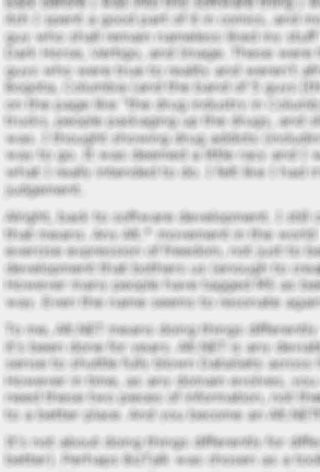
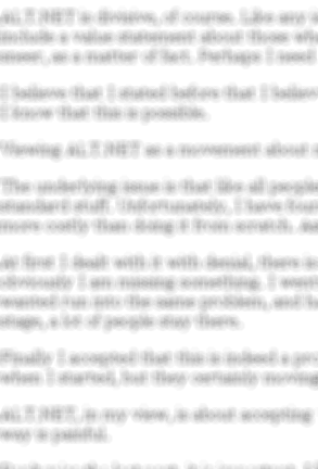
 Okay, let us see if I can get this post readable. If I am successful, you are supposed to see two images, one to the left and one to the right.
Those images represent two blog posts, they are blurred on purpose, I don't want to talk about the content, I want to talk about the presentation here.
The main difference between those two posts is the amount of text that goes into one paragraph. This has a direct correlation to the way that I read content.
The post on the left is painful to read, it has massive amount of text that I need to parse and read. I actually stopped reading it when I figure out that I was merely scanning it to avoid actually reading the content.
By reducing the amount of text per paragraph, you are making it easier to read the content, you let the eye skip to the next one naturally, instead of having to parse it.
Books can get away with it somewhat, because they have much higher resolution, but on the web, you cannot. You have to pay attention to the way you are writing.
Short paragraphs make it more pleasant to read the content. Dense content is painful to read, and it gives the feeling that it is dry, even if it is the most fascinating subject on the world.
And that was a whole post that could be surmised as "just hit enter more often, dude", sorry.


Comments
Have you ever read a book by Jose Saramgu ?
He can span paragraphs across pages.
And he's genuinely brilliant.
I couldn't put down 'The Gospel According to Jesus Christ' and 'Blindness'
So, at the end of the day, it's down to one's writing ability, not only the visuals.
For me, as I definitely lack any writing skills, I'd stick with short paragraphs from now on. Maybe it'd help ..
There is a major difference between books and reading online, though.
I'd say that the difference is between literature and scientific articles. The type of the media is less of an issue than it's content
Another problem with blog posts are browser display problems. In this blog for example, images like above or source code bites with the sidebar on IE6 (hiding flow text under the sidebar) and thats why I some times need to span the window over two monitors.
Thats awful to read...
PS: No rant against the blog. I guess it's rather IE6 that's causing the problem...
Its like you are talking about my blog posts. :)
I'll get it, eventually.
I agree, and blog posts should be more like newspaper articles. Ever read a newspaper? One sentence paragraphs are the norm. Three sentence paragraphs are about the max.
I find high dpi displays awesome for reading.
Comment preview