Visualizing Map/Reduce in RavenDB 3.0
We are working hard on RavenDB 3.0 and a lot of the work now goes into the spit & polish phase. Usually this is a pretty boring part. Making sure that intellisense works in the right places, that the UI makes sense, that we give the right results, that the logs are helpful, etc.
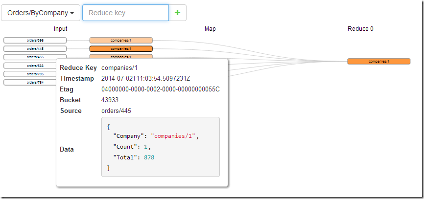
But occasionally we get to actually do really cool stuff in this phase, and one of them is this guy:
Map/Reduce is a very powerful technique, but it can be hard to figure out issues sometimes. We always had debug endpoints to help actually figuring this out, but we are now putting a lot of attention on surfacing them to the user and making this easy to understand.
The map/reduce visualizer is a great example of that.


Comments
I hope that wasn't a list in priority order:
ui, ui, GET THE RIGHT RESULTS, logs
Damien,
We already have the right results, we are now working beyond that.
Sorry, I meant, we are showing the right results in the UI.
We have a lot of endpoints that aren't exposed currently.
This is all just UI work.
Looks good!
Are you using a JS framework to generate that chart? If yes, which one?
I wish I could take credit for this part of the Studio, because it looks awesome! Nice work, guys!
Scott: I know we're using NVD3 for index statistics graphs. But this is the first I've seen of the map/reduce visualization, so I'm not sure what it's using.
@scott .. looks like D3 to me...
Yes it is D3. https://github.com/mbostock/d3/wiki/Gallery
Comment preview